The A-Z of Patterns 2008
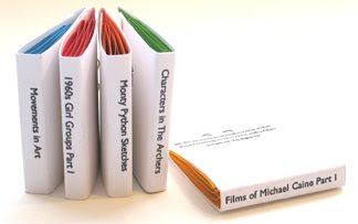
The A-Z of Patterns is a book showcasing patterns I created using each letter of the alphabet set in Times New Roman and then in Verdana.
I have never
An Atlas of the British Isles showing Aberdeen was my starting point.
I have never was a one day project. Using stickers and one piece of cut-out typography (above).
It is based on the idea that I have never used a lot of my household items in the way they are intended or even at all. Most of them were gifts and I felt guilty every time I saw something I hadn't used. Some where expressions of my ignorance in certain areas. I have never read the Greek Myths. Each object has a back story, where they came from, who they relate me to, how much they cost. Through making stickers and labelling these items I was able to admit to many things, my habit of collecting, regular guilty feelings, my lack of care, the care taken to hide my ignorance, my dislike to some things, small white lies and that the present giver is usually a reason to hold on to something rather than the actual object. So there it is, I've used them now, the guilt has gone.
'I Prompt You'
Here is a nice little task given to me by the guys at 'I Prompt You'. Drawn unnaturally with my left hand.
Part of YCN LIVE 'I Prompt You' is a participation event to encourage members of the public to draw, by asking them to fill in prompt cards using their left hand. See their findings and creations at Rough Trade in Brick Lane and check out their blog.
What is Graphic Design? (Again)
What is Graphic Design, as answered by Graphic Designer Craig Oldham.
Printed at my first evening class in Silkscreen at Wimbledon college, way back in January. The red indicates what I believe are the core aspects of Graphic Design is within Craig's answer. Check out Craig's interesting and inspiring projects on his website.
Words from Craig, design by me.
Printed at my first evening class in Silkscreen at Wimbledon college, way back in January. The red indicates what I believe are the core aspects of Graphic Design is within Craig's answer. Check out Craig's interesting and inspiring projects on his website.
Words from Craig, design by me.
What is Graphic Design? (Again)
Here is the answer from Douglas Wilson who uses letterpress to create beautiful posters.
Words by Doug, design by me. Doug has also uploaded this poster on to his blog.
What is Graphic Design?
Alistair Hall from We Made This contributed his answers to 'What is Graphic Design?' The idea of cutting back the words to provide a simple answer struck me and inspired the next two posters (above). This inspired the cut out technique.
Words from Alistair, design by me.
Lisbon. Spain. Morocco
Proctors and Stevenson
I spent a weeks placement at Proctors and Stevenson
in Bristol this summer. It was great to experience 'real' work, with a well established firm. I had a mini project of logo design and branding for ESDIN and spent lots of time chatting to people about their roles, a great insight. Got the chance to visit a real live printers, which was great. Thanks to Mike Cain, creative director for all his help and knowledge.
Here's an example of a letter format with the logo I designed, all this corporate malarkey is new to me, but I like it a surprising amount!
Harrington and Squires
Spent a lovely morning at Harrington and Squires a few weeks back.
H&S are letterpress printers and designers Vicky Fullick and Chrissie Charlton.
They shared their extensive knowledge, examples of lots of great work and an impressive book collection.
It's an amazing studio, dubbed the corridor due to it being only 1.2 meters wide. Vicky and Chrissie were very accommodating and clearly have great intelligence and witt when it come to typography and metal type.
UNFOLD for the Design Museum
26 Letters 2007
26 Letters is a self-initiated project cataloging 26 letters I sent to myself.
Each envelope was created to test whether it could reach the destination despite different versions of the address or stamp. These variations included a map of my address, missing information and a visual version of my address.
Each envelope had a letter of the alphabet inside, hence the name 26 Letters.
Cover of 26 Letters
Opening spread of 26 Letters
An example of the layout
Examples of the envelopes I sent
Subscribe to:
Posts (Atom)